DOORSTEP
Doorstep is more than delivery, it’s a service that turns the everyday into a premium experience. In this project, I translated that vision into a visual identity built on precision, sophistication, and flow. The result? A brand that arrives before the package does.
CREDITS
• Creative leaders: Pedro Dutra e Pedro Vieira
• Design: Pedro Dutra e Pedro Vieira
• Studio: Capina®

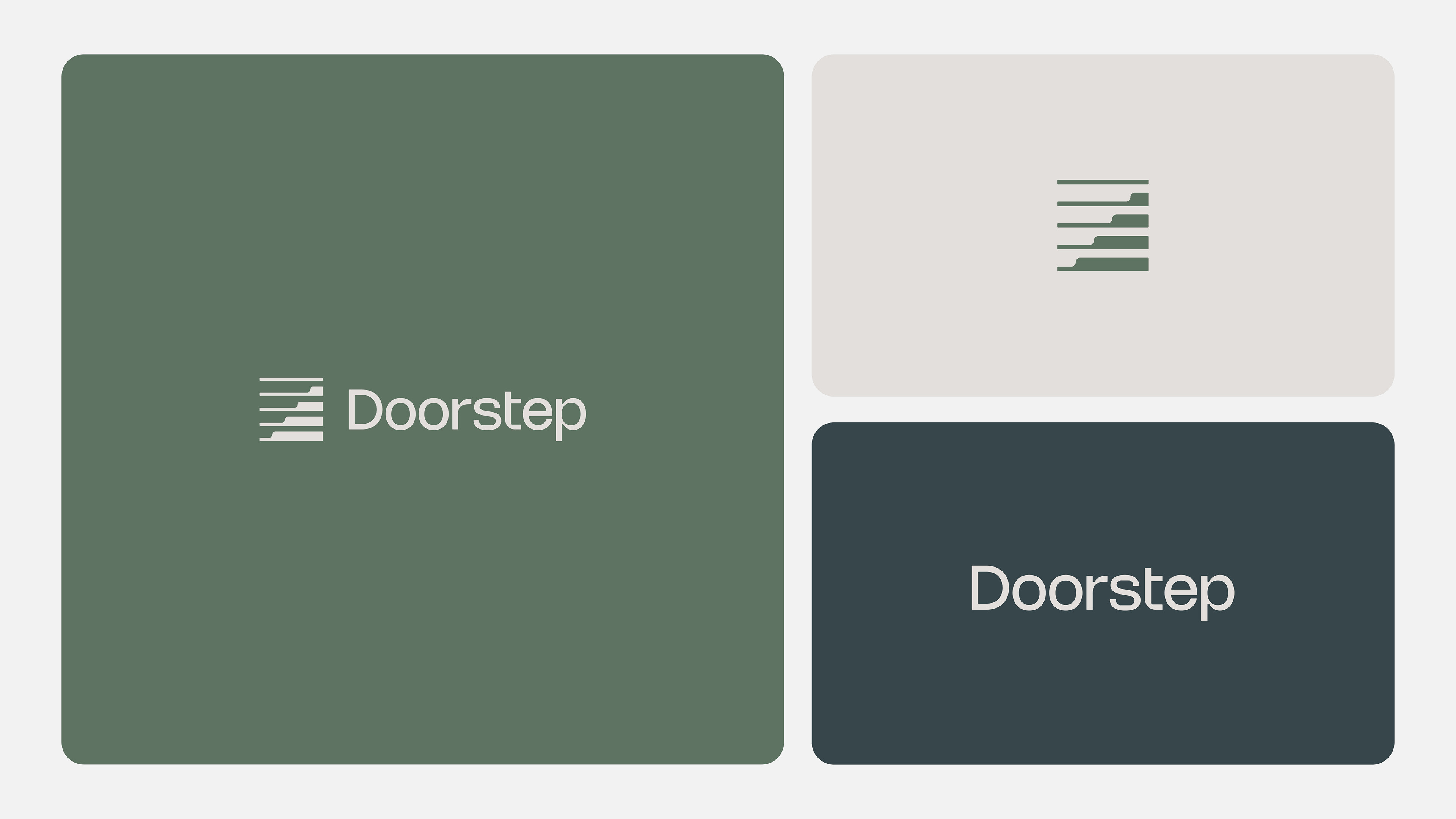
Doorstep is refined, professional and approachable. It delivers modern luxury service with attention to detail while showing residents their time matters.
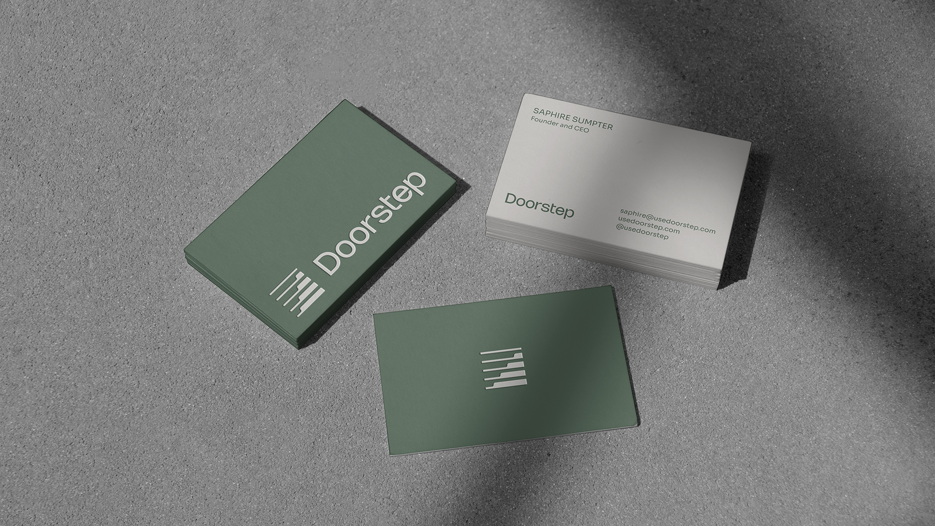
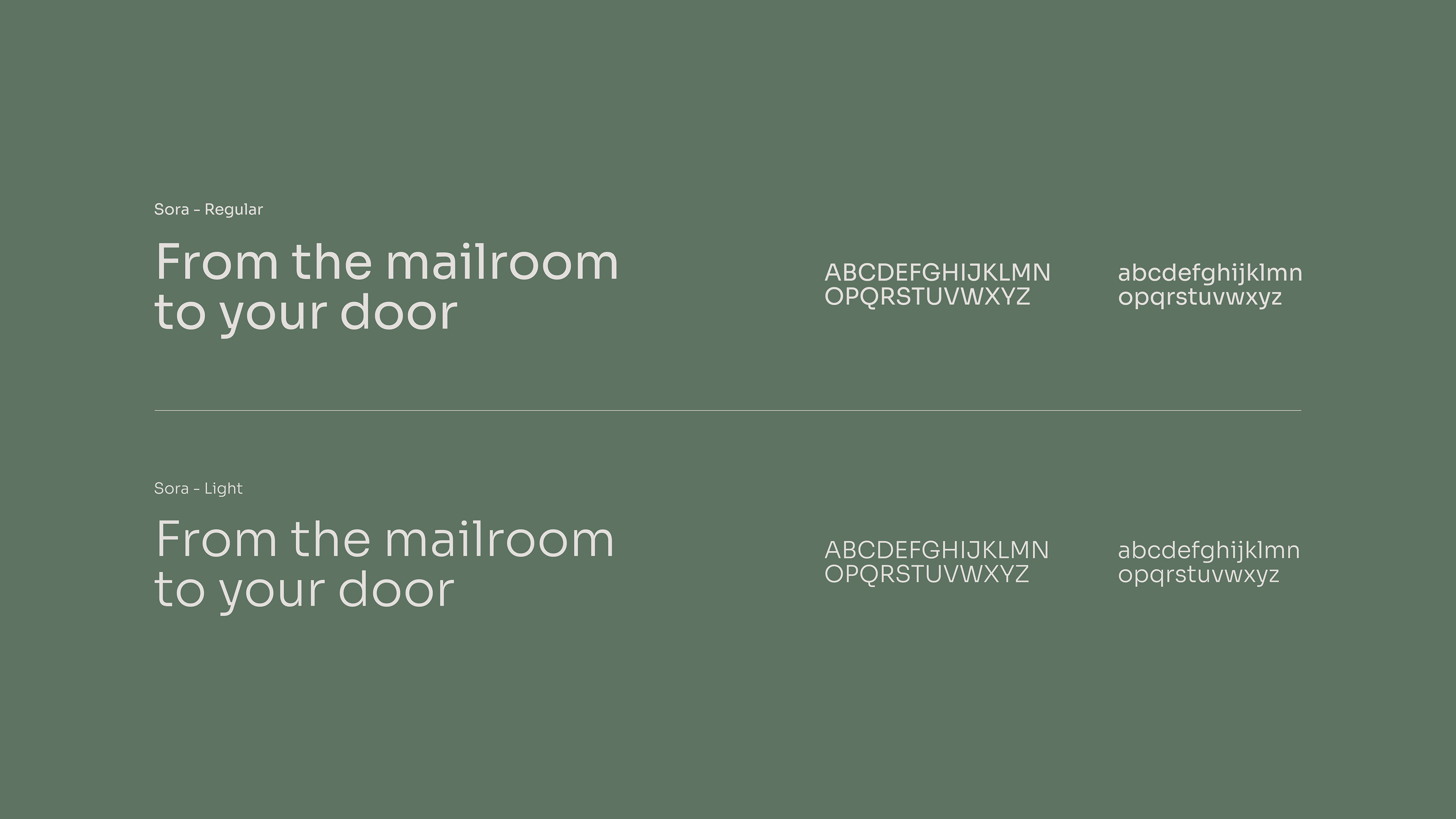
Doorstep's typography embodies elegance, stability, and confidence. Its balanced forms maintain discreet sophistication, complementing the icon and reflecting the brand's refined and reliable approach to premium service.
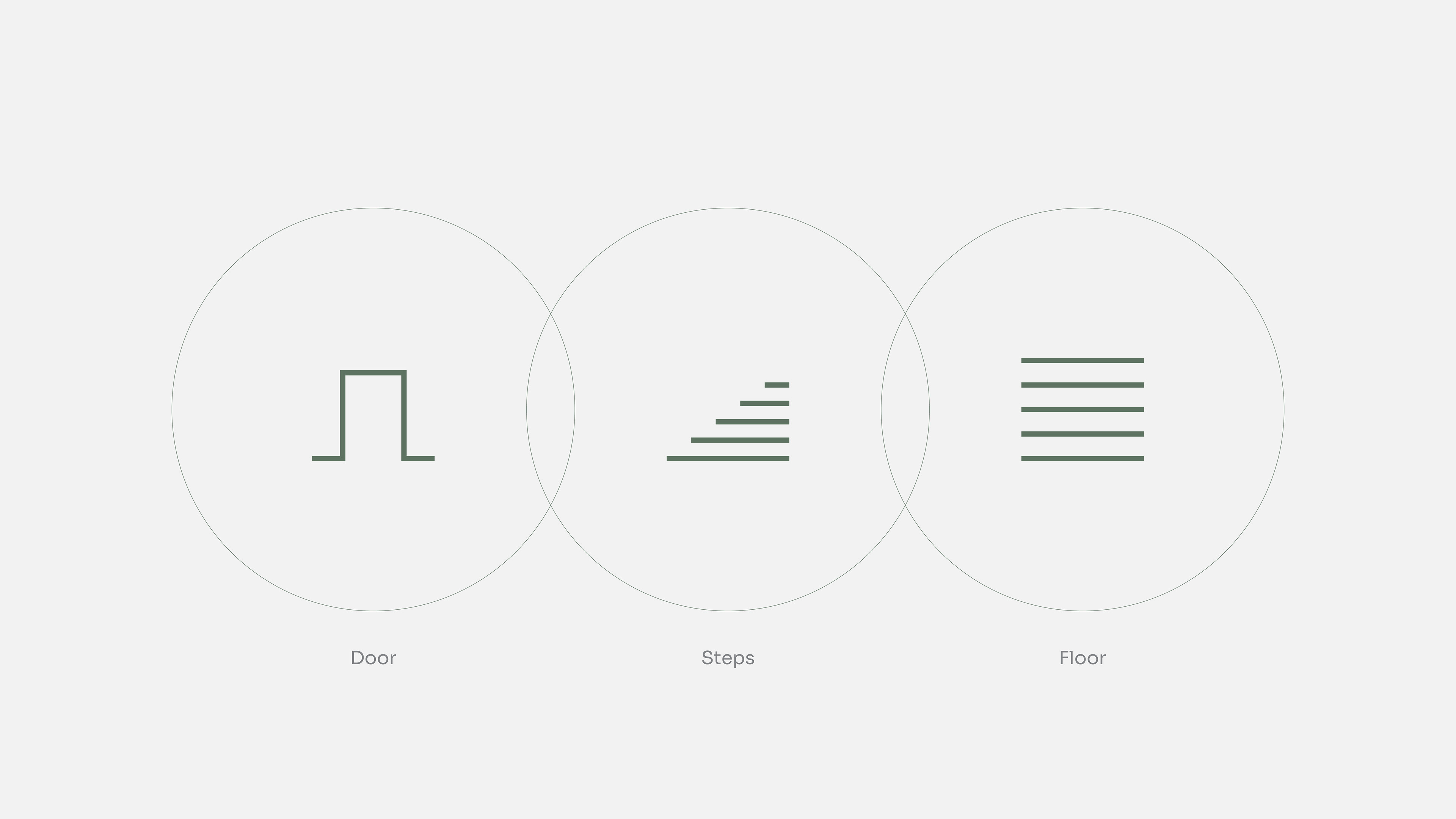
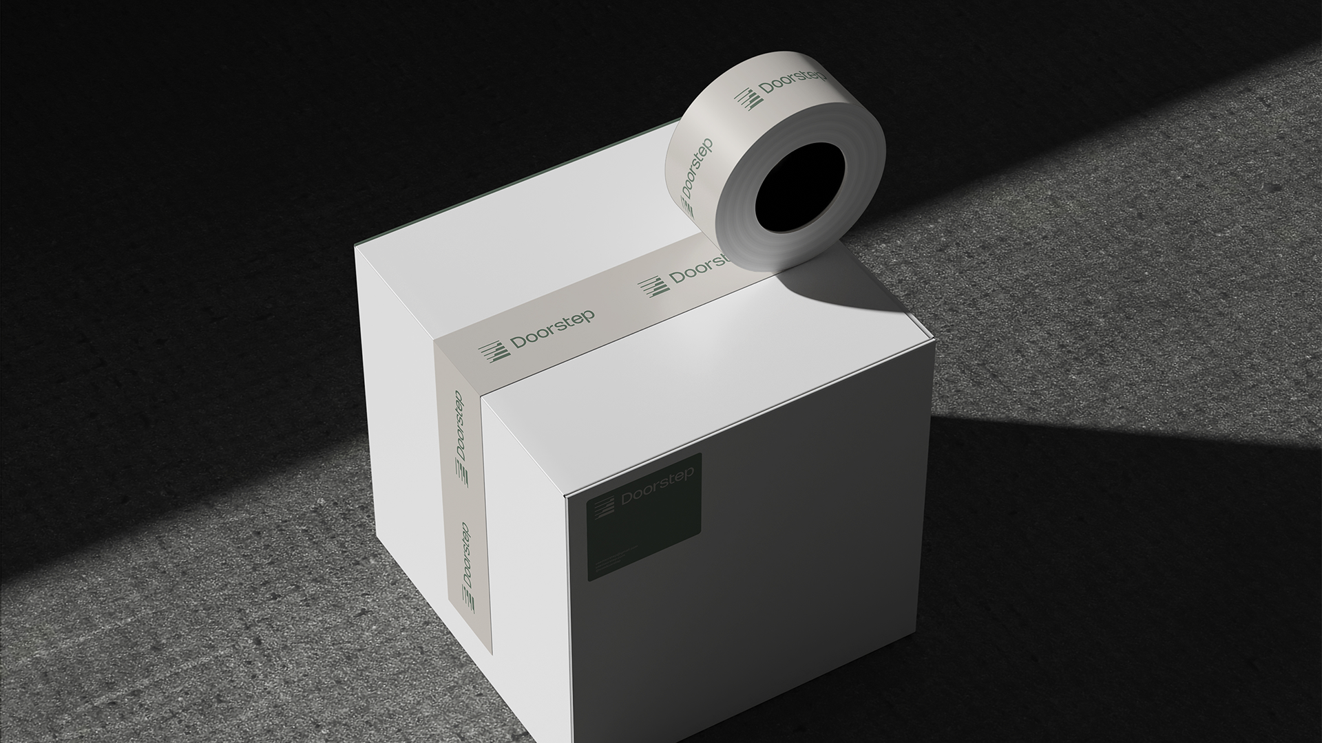
The brand's icon not only incorporates the representation of a door, steps, and floors but also conveys movement, an essential aspect of Doorstep's service. Additionally, its fine lines and rounded corners evoke a sense of comfort and convenience.

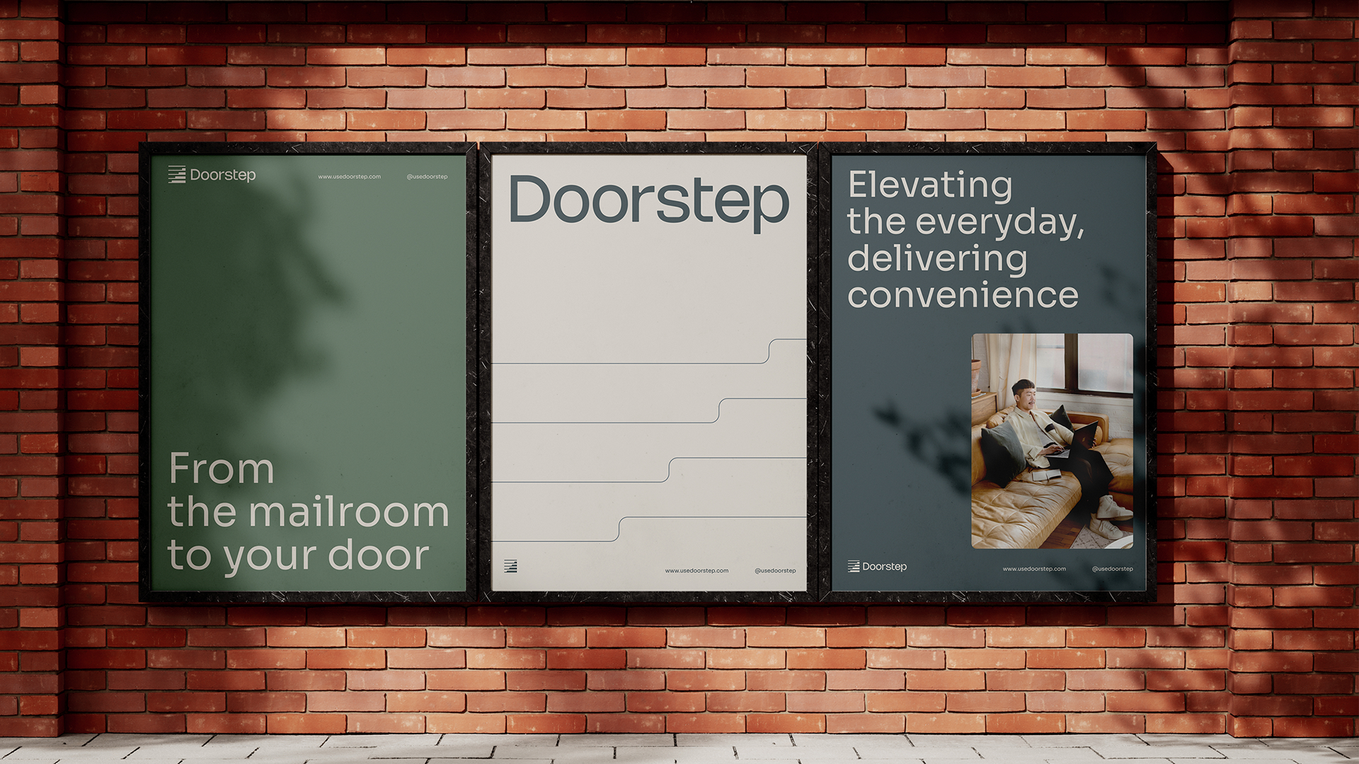
The idea is to create a more fluid layout to contrast with the stability of the typography, adding a sense of movement to the designs. This allows photographs to be arranged ”freely” rather than strictly aligned with the text. Another element that enhances the feeling of comfort is the use of rounded edges, along with the brand’s typography.